How Can I Visualize Measurement Data?
Test engineers, measurement technicians, and many other professionals often face the challenge of efficiently visualizing and analyzing large volumes of measurement data. Managing such data requires precise and powerful tools that can present relevant information quickly and clearly. However, suitable software solutions that meet these needs are often lacking, leading to unclear reports and inefficient workflows.
imc FAMOS provides a comprehensive solution to these challenges. With its intuitive yet powerful visualization and analysis tools, FAMOS enables simple and efficient data representation, even with measurements involving thousands of channels and millions of data points. The software supports a wide range of chart types and offers numerous customization options to make data presentation both insightful and professional.
A typical procedure for loading and viewing measurement data and marking events
How Can I Easily Visualize Measurement Data in imc FAMOS?
In this article, we’ll provide an overview of how you can quickly visualize both small and large volumes of measurement data with imc FAMOS, making adjustments as needed to support informed decision-making and improve the quality of your work.
Loading Data and Opening a Plot Window
The first step in visualizing your measurement data is to load it into imc FAMOS and open a plot window.
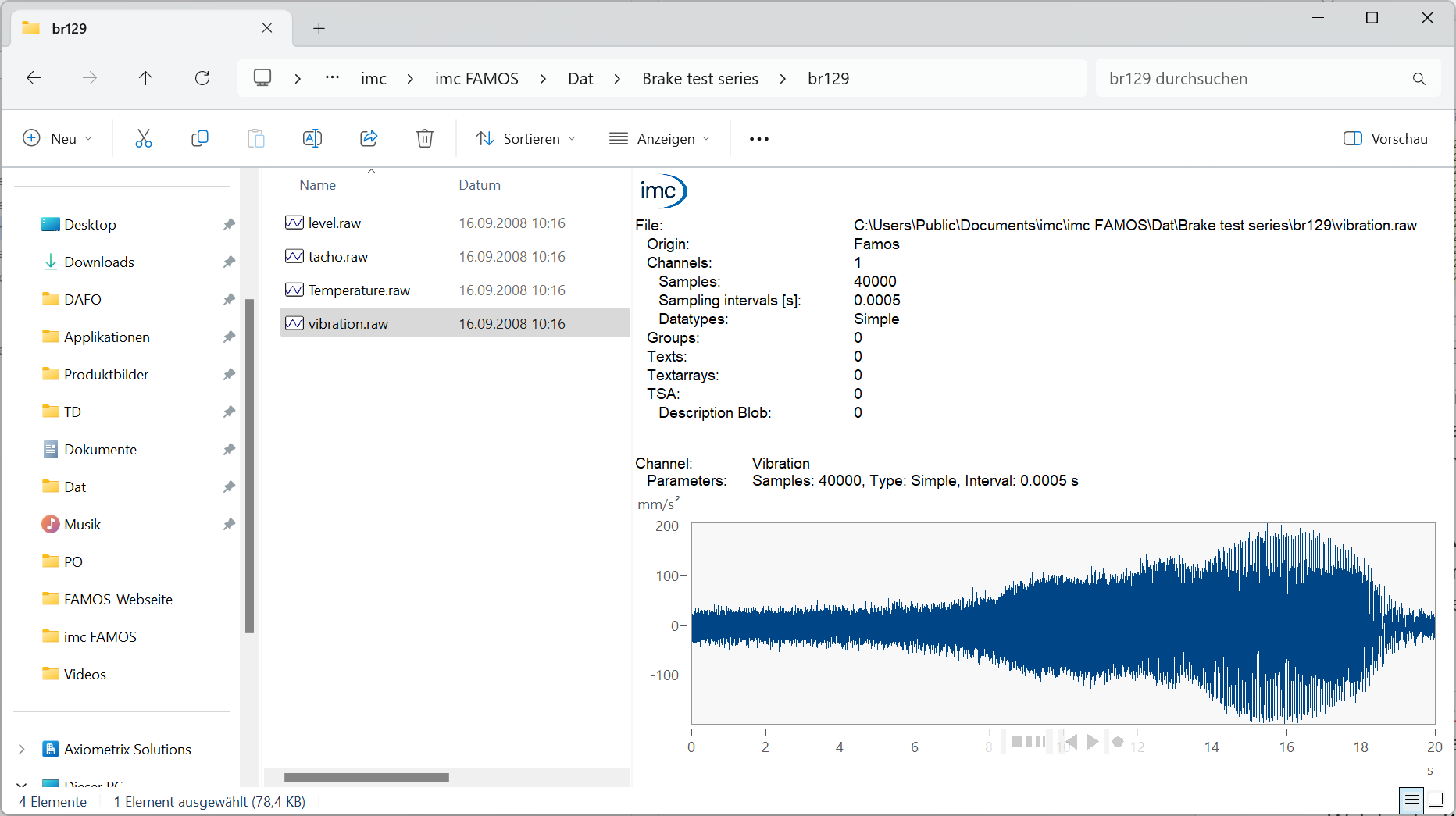
Loading Data: Open imc FAMOS and select “Load Data (with File Dialog)” on the start page. Navigate to your data directory and select the desired file. Sample data, like “slope.dat,” is available in the default directory after installation.
To load a CSV file, select the file type “ASCII/Excel Import… (.).”

If you are already in the main window, you can access the same dialog via the open icon above the variable list. Alternatively, you can use the embedded FAMOS data source browser or simply Windows Explorer to drag and drop data into the variable list.
The file browser and Windows Explorer also offer a preview of the measurement data in which you can view the data before loading, zoom in (see below) and see metadata, e.g. which measuring device was used.
Opening a Temporary QuickView: After loading the file, the channels will appear in the variable list and are automatically plotted in the QuickView area at the bottom right.
You can control which channels are displayed by selecting them in the variable list. The QuickView window shows exactly what is selected, and the display is temporary, so any changes are lost when the selection changes.
The QuickView display type adjusts automatically based on the data. Channels with the same unit are shown on the same axis for easier comparison, matrices appear as color maps, and GPS position data is shown on a map.
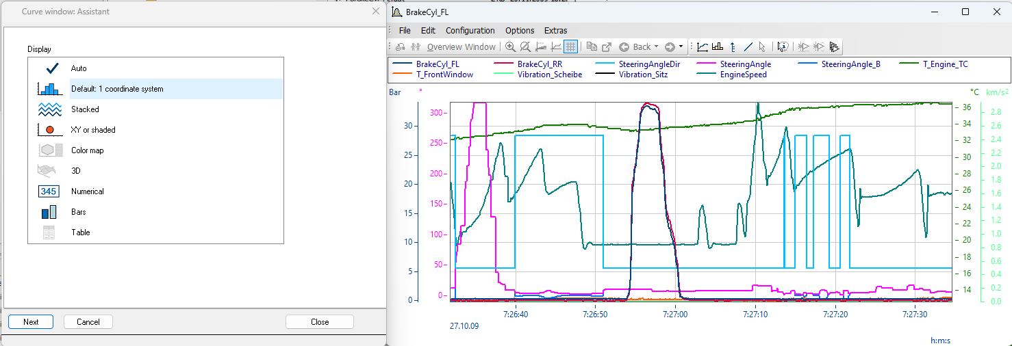
Opening a Curve Window: For a flexible, persistent view, click the Curve Window icon above the variable list to open a floating curve window. This window displays the selected channels in a chart you can freely move around on your screen.
The display initially adjusts automatically like in QuickView, but an assistant appears, allowing you to stack, overlay, or show channels in XY mode.
Highlighting Interesting Areas
A Curve Window in FAMOS offers numerous customization options to optimally present the relevant sections of your data:
Adjusting Size and Position: You can change the size of the Curve Window and move it to any position on your screen. This facilitates the simultaneous viewing of multiple windows (e.g., time data and frequency spectra) or improves visibility when displaying many stacked channels.
For stacked curves, you can adjust the height of each coordinate system by dragging the divider with your mouse, allowing you to emphasize the amplitudes of individual channels better.
Navigation and Zoom Functions: Navigate using your mouse over the axes to display navigation bars. By dragging the elements of the bars, you can zoom quickly around the center of the coordinate system and shift the visible data area. If you want to zoom around a specific point on an axis, you can do so with the mouse wheel while hovering over the corresponding axis position.
These functions are particularly useful for navigating large data sets and highlighting specific data points. You can always return to the previous zoom level using the "Back" button.
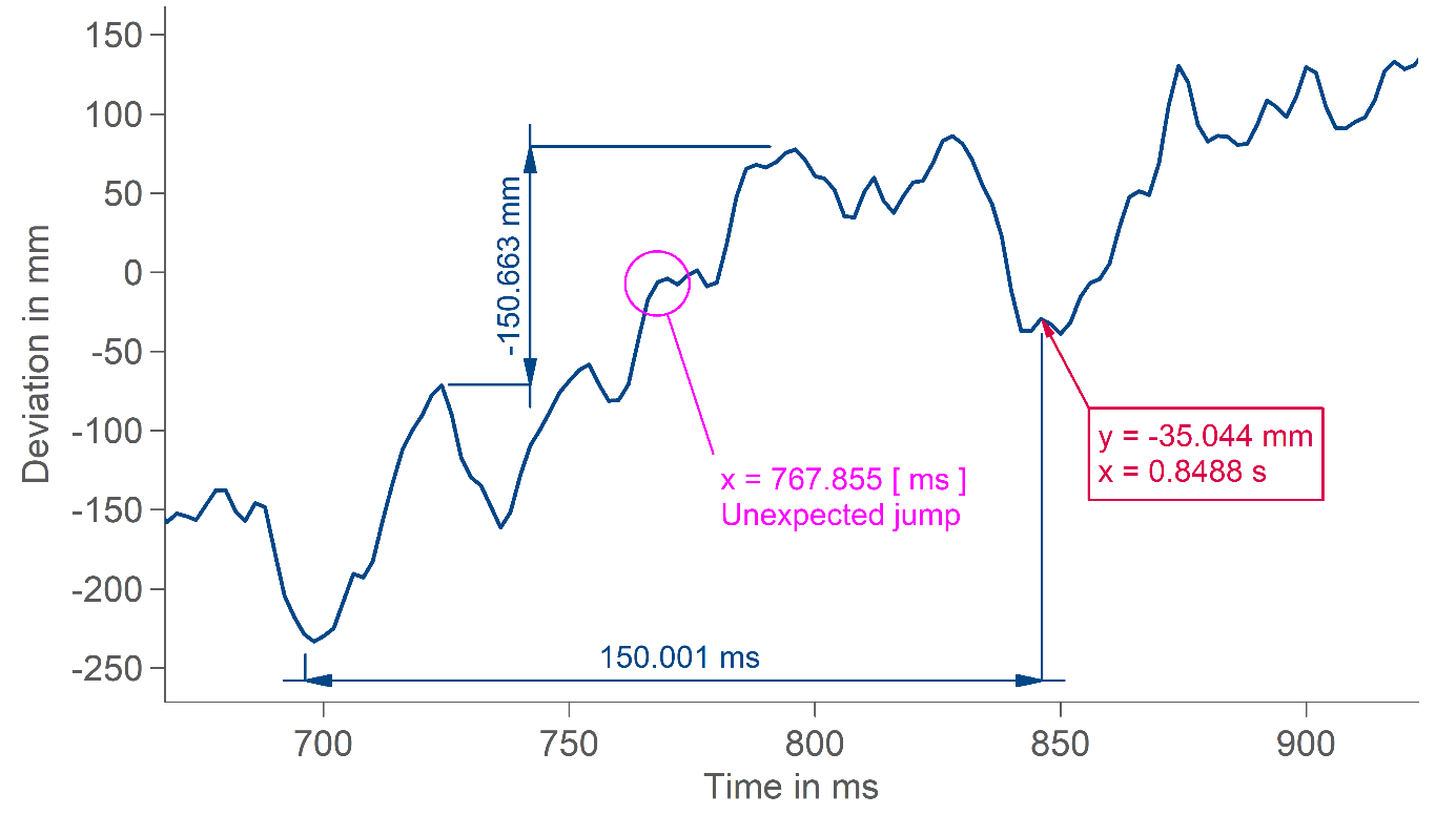
Setting Markers: With a mouse click, you can set a marker at the maximum and minimum value of the data set. To do this, select "Marker at Min/Max" from the Edit menu. Alternatively, you can right-click to display the marker toolbar.
You can also insert freely positionable markers, measurement lines, and various other types of markers. Accidentally placed markers can be deleted with a right-click.
You can easily move them with your mouse. Other properties such as font size, text content, or color can be changed with a double-click. This allows you to highlight relevant points in the data, even across zoom operations.
Configuration of Axes and Lines
An appropriate configuration of axes and lines can be crucial for the clear representation of your data:
Configuring Axes: Double-click on an axis or navigate to "Configuration" in the menu and then select "Axes." Here, you can set the scaling, labeling, and tick spacing of the axes. For example, you can switch the x-axis to "Fixed Setting" and set the zoom range from exactly 0 ms to 1 ms while adjusting the y-axis to a range of 10 V to 35 V.
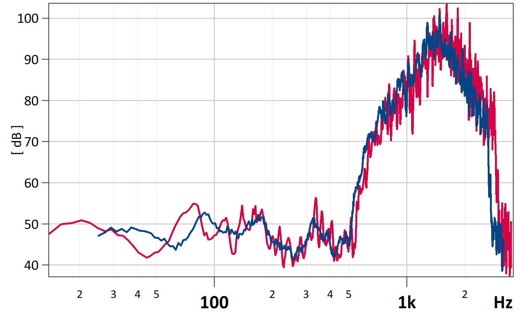
Logarithmic Representation: The y-axes are typically linearly scaled, but you can also change them to logarithmic or dB scaling, depending on your data requirements. These settings are also available for x-axes, making them particularly useful for XY representations or spectra.
For the x-axis, you can choose between absolute or relative time representation. In relative time representation, the time since triggering is displayed, making this mode suitable for comparing measurement series.
You can also configure a third-octave or octave representation, which displays a suitable two-line axis label for the corresponding spectra.
Setting Labels: The axes are always labeled with the appropriate units, but you can add your own labels for a more detailed description of what is shown in the diagram. These labels can be inserted on each axis or as a title above the entire diagram, and you can freely style the font.
If your data set has only a few samples, you can also insert a label at each sample, usually displaying the value at that point. This can make the diagram mostly self-explanatory.
Choosing Line Types: By default, linear interpolation is used between samples, which is optimal for most data representations. However, you can configure the lines to be displayed as steps, bars, or spikes.
Additionally, you can highlight individual samples with symbols, which is especially helpful when dealing with data that has different sampling rates or timestamped data, allowing you to examine the temporal shifts closely.
Furthermore, you can freely choose the line color and activate a mode where each line is represented in a different line style. This way, you can print a diagram with multiple overlapping channels even without a color printer.
What options do I have for visualizing measurement data, even with millions of data points?
imc FAMOS is capable of efficiently displaying large data sets, even when dealing with millions of data points.
Efficient Data Visualization: imc FAMOS optimizes the representation of large data volumes through intelligent data reduction techniques. This means that only relevant data points are displayed without losing important information. For example, you can display a complete measurement series while still zooming and navigating smoothly. This feature is particularly useful when working with very large data sets, where conventional visualization methods may struggle.
Highlighting Extremes: You can use Min/Max markers to identify extremes in specific areas of your data. You can zoom into individual data sections, set an automatic Min/Max marker, and then navigate to the next area. When you zoom out afterward, all markers will be visible simultaneously. If you only want to highlight Max values, you can delete the Min markers by right-clicking on them.
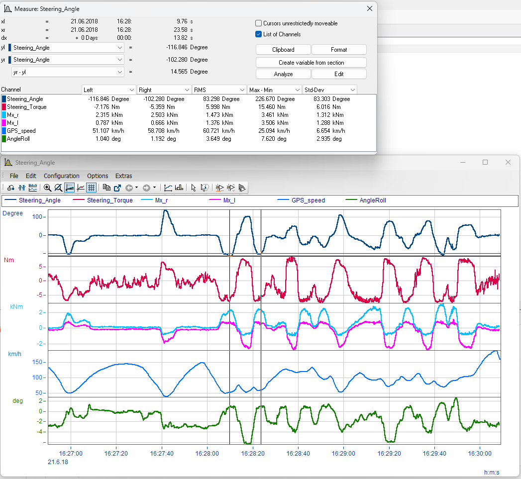
How can I evaluate measurement data with diagrams?
With quick representation, easy adaptability, and the ability to highlight interesting parts, the imc FAMOS curve window provides an ideal foundation for evaluating measurement data.
Advanced Analysis Tools: Use the integrated analysis tools to conduct statistical evaluations and assess your data in detail. The measurement window offers measurement cursors and calculations such as mean, slope, RMS, and standard deviation, helping you gain key insights from your data and make informed decisions. For instance, you can calculate the mean of a section to identify general trends or pinpoint extremes to investigate anomalies.
Exporting Finished Diagrams: Completed diagrams can be exported in standard formats, allowing you to present your findings to colleagues or facilitate decision-making for your supervisors with meaningful representations. For example, you can embed high-resolution diagrams in PowerPoint slides or Word documents, or generate PDF files.
Alternatively, you can save and share the curve window configuration, including raw measurement data. The freely available imc FAMOS Reader enables anyone to open such files, providing your colleagues full access to the details of the measurement data.
Visualizing Measurement Data with imc FAMOS
If the issues of inefficient data visualization are not addressed, you risk inaccurate analyses and misinterpretations, leading to wrong decisions and potentially costly mistakes. Efficient and precise data visualization is essential for making informed decisions and ensuring the quality of your work.
With imc FAMOS, you can quickly and flexibly tailor your visualizations and analyses to your specific needs, making the software an indispensable tool for test engineers, measurement technicians, and other professionals. The ability to utilize various chart types and analysis tools gives you the flexibility to examine and interpret your data in diverse ways.
Tip: For large datasets, you can create an overview window through the “File” menu, which shows the entire dataset even after zooming in on a specific time range. Both curve windows are linked, allowing you to navigate to another section via the overview window.
Try out how you can use imc FAMOS for your data visualization. Load your measurement data into imc FAMOS, open a curve window, and customize the representation to meet your needs. Utilize the extensive visualization and analysis tools to efficiently capture and evaluate your data.